
Ad Age
The Branch Museum of Design’s rebrand is rooted in its own architectural history
2025-10-30
The Branch Museum of Design in Richmond, Virginia, has gone back to the drawing board and built a new brand off its original blueprint.
The museum just introduced a new visual identity, developed by MullenLowe Design Studio (MLDS), that reflects both the museum’s architectural heritage and its evolving role as a modern hub for creativity. The refreshed look seeks to position The Branch as a brand rooted in design thinking rather than traditional museum tropes.
Housed in a Tudor Revival mansion designed by John Russell Pope—the architect behind the Jefferson Memorial—the museum’s setting has long connected design history with cultural preservation. The new system draws directly from that architectural legacy while pushing toward a more dynamic and adaptable visual language.
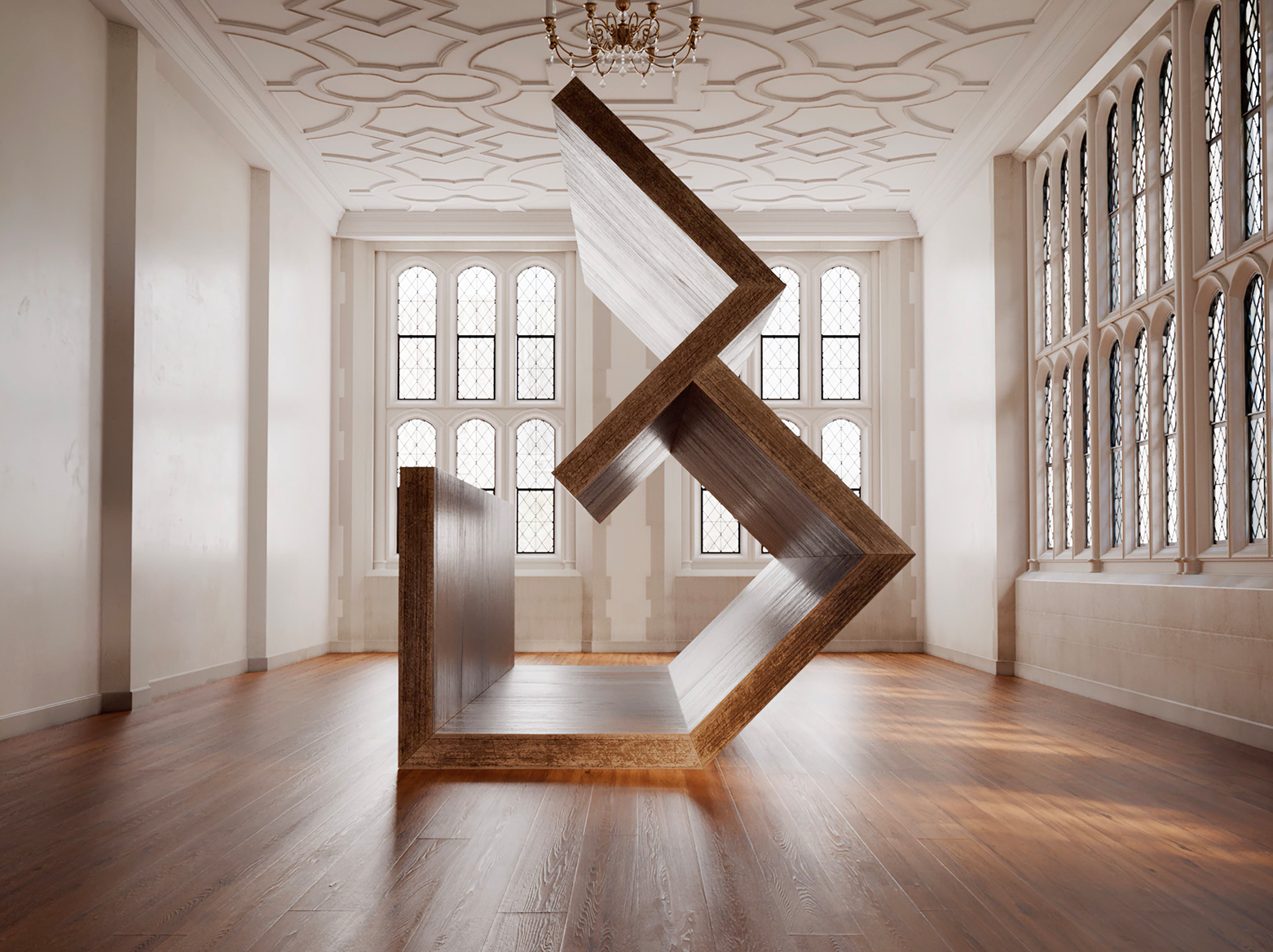
The new logo, built from Pope’s original blueprints, merges three sharp gables into a sculptural “B” that doubles as a house when rotated. The design speaks to both structure and symbolism: a nod to the museum as a living home for design. Its slightly off-center orientation suggests motion and reinterpretation, qualities that reflect Richmond’s creative energy and the museum’s commitment to questioning convention.
“We think of The Branch not as an institution but as a brand, and asked for a visual identity that would make us unmissable and unmistakable,” said Kristen Cavallo, The Branch’s executive director (and the former global chief creative officer of MullenLowe Group). “When MLDS brought forward Pope’s 1919 architecture to our 2025 identity, we knew we had something special. They captured the entire conceptual leap, from physical form to brand form.”
Beyond the logo, MLDS crafted a comprehensive design system that spans wayfinding, signage, merchandise and digital media. The modular framework allows for flexibility across platforms, with an open palette that can shift to reflect the artists and exhibits on display. The identity aims to make the museum’s storytelling more cohesive and accessible while allowing the physical and digital experiences to mirror each other in tone and intent.
“We wanted to tell a single, connected story, one that ties together this building, this city and this museum,” said Katie Hoak, the museum’s director of marketing. “Design, for us, is about meaning, not ornament. Every choice should reflect who we are and why we exist. With so few museums dedicated to design in the country, our own identity needed to embody the same thoughtfulness we ask of the work on our walls.”
The Branch now also has a “sonic identity,” created with Brazilian studio Evil Twin. The audio composition translates architectural forms—arches, grids, gables—into sound, turning the building’s geometry into rhythm and melody. João Paz, head of design at MLDS, described the process as transforming the museum’s structure into a narrative that can be heard as well as seen.
The project arrives amid a broader rethink of how cultural institutions define themselves. As museums across the country grapple with questions of relevance and trust, The Branch is positioning its brand as both a visual and philosophical statement: that design is not just what fills the galleries, but what shapes the institution itself.
That redesign also speaks to Richmond’s broader creative surge. The city’s cultural scene, anchored by institutions like VCUarts and the Virginia Museum of Fine Arts, has helped make it a national magnet for artists, designers and storytellers. The Branch’s shift toward design in all its forms is both a reflection of that and a contributor to its momentum.
“A strong visual stance signals seriousness—it tells us you understand the language of design, not just its display,” said artist and furniture designer Colin Knight. “It’s a magnet for creative people.”
This article was originally posted on Ad Age: HERE