Ad Age
Top 5 Logo Changes of 2023
Looking for new attention, brands including Pepsi, Jell-O and Max went bold
2023-12-01
Using 3D effects, pulses and other eye-catching displays of creativity, brands taking on new looks went bold in 2023. Other venerable names changed designs completely to signal larger adjustments in their businesses.
Here are the top five brand logo changes of the year.
Nordstrom Rack, the department store’s off-price division, looked to its 1970s heritage in creating a funky new logo and brand design that began rolling out this year. The new look, the first in more than 10 years, was meant to help differentiate the brand in the minds of consumers and help it emerge from a sales slump.
The new logo was designed on a modular grid to be compatible with digital and mobile formats and consistent in both the physical and digital worlds. Nordstrom Rack’s blue coloring evolved to incorporate several shades of blue, with additional palettes signaling seasonal changes and amplifying sales and promotions, the company announced. Jones Knowles Ritchie was behind the new design.
America’s jiggliest treat got a new look this year as Jell-O owner Kraft Heinz looked to contemporize the brand for a younger generation. The new look includes a bold-but-friendly all-caps logo with a 3-D appearance (Coca-Cola’s Fanta introduced a similar effect in its new packaging this year.)
Jell-O’s new look is accompanied by modernized claims meant to highlight the food’s permissibility, such as replacing the phrase “sugar-free” with “zero sugar.” The new look from BrandOpus was rolled out across the entire Jell-O portfolio, including pudding, gelatin, cups and boxes.
In a branding move that left some observers scratching their heads, the merger of HBO Max and Discovery+ left the former without its first name. Rechristened simply as “Max,” Warner Bros. Discovery’s streaming TV service relegated “HBO” to a tab. The change acknowledged that the HBO name, despite being known for quality programming, also came with baggage in the form of a pricey reputation for some audiences. The new identity also signaled the availability of Warner Bros. Discovery’s content as part of the combined package, brand execs said.
Max’s revamped logo from DixonBaxi combined the HBO “bullseye” with curves from the Warner Bros. logo, the design agency said.
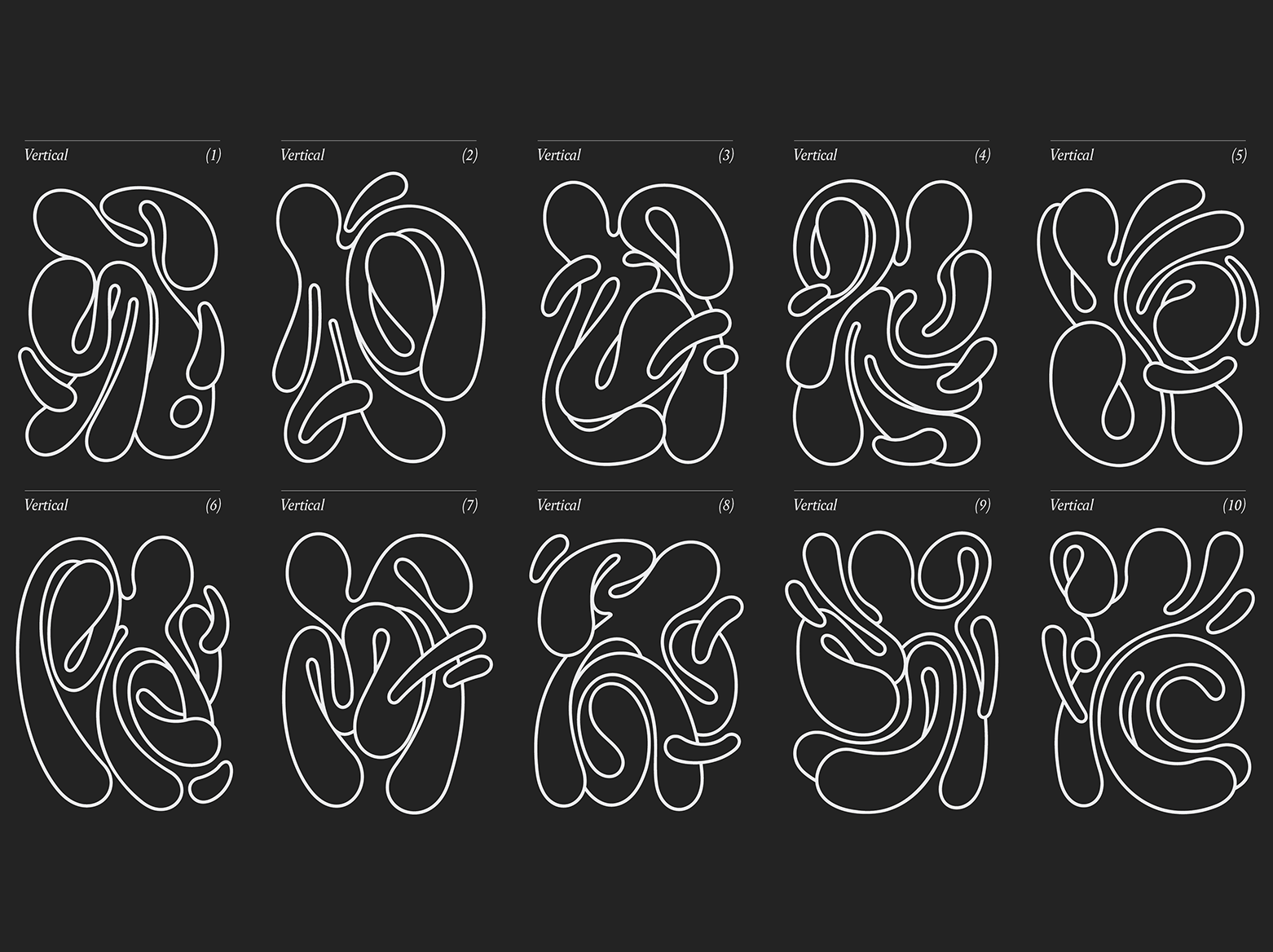
When MullenLowe went to retire its “challenger octopus” logo, it didn’t replace it with a single static image, but rather, a potentially infinite number of them. Today, an ocean of abstract, free-flowing octopi—each one unique—represent the agency, and employees are welcome to make their own octopus via an app.
The move demonstrated the shop’s creativity along with its ability to “break free from the corporate agency world,” João Paz, head of design at MullenLowe U.S., told Ad Age.
“There’s an opportunity here to do something that will demonstrate our level of craft, our design capability and how this agency is different,” added Lu Borges, MullenLowe’s head of brand and communications. “You can attract clients by building a case study off your own brand.”
Unlike rival Coca-Cola, which takes pride in the year-in, year-out durability of its design, Pepsi has long seen itself as a brand for younger generations and as such, periodically revamps its look. This time around, it went bold behind electric blue and black colors, an aggressive Pepsi wordmark going back inside the globe, and pulses and ripple effects radiating out from the logo. Executives say it reinforces Pepsi’s association with music—while generating attention on store shelves.
This overhaul was Pepsi’s 12th logo revamp since its founding in 1898 and its first since 2008 when it introduced the smile globe and lower-case wordmark. That design had grown “a little muted by today’s standards,” said Todd Kaplan, Pepsi’s chief marketing officer.
The new look came with a whiff of controversy when Pepsi first professed to have created the new look in-house before acknowledging that outside design firms including Mrs&Mr also had a hand in the design.
This article was originally published on Ad Age here.
