Arizona Coyotes We Hockey
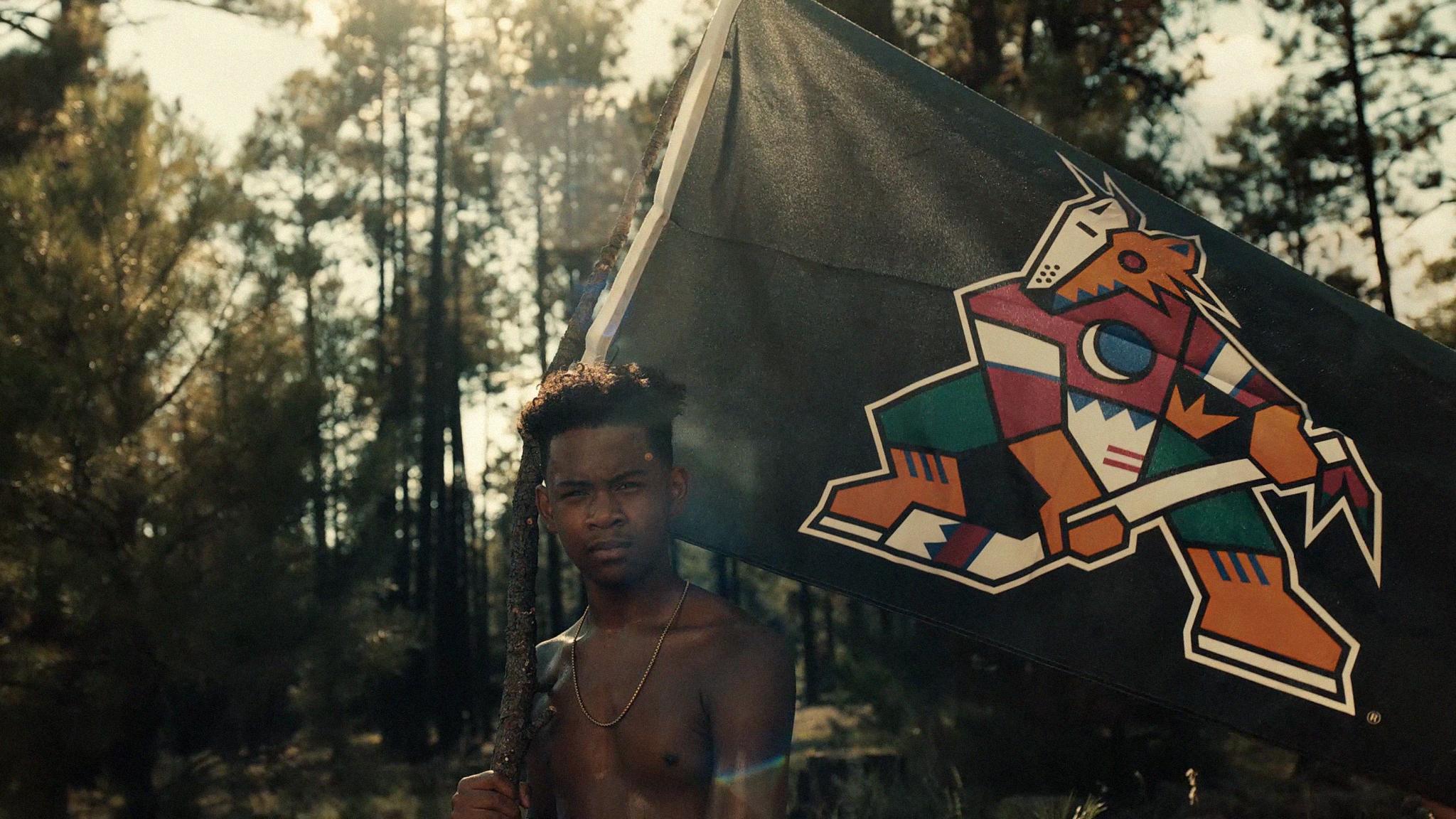
From Desert to Ice
Hockey has been the slowest sport to diversify its roster and its audience. So, we took a team from the unlikeliest place—the desert—and turned it into the unlikely champion for a more diverse future of the sport. Not hockey as it is, but hockey as it could be.
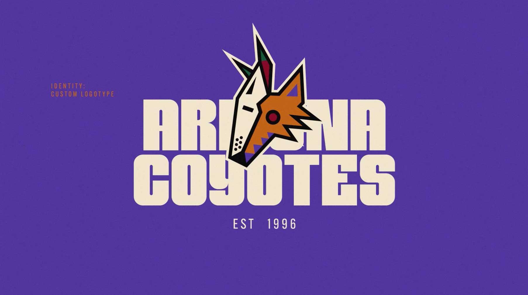
A new take on hockey.
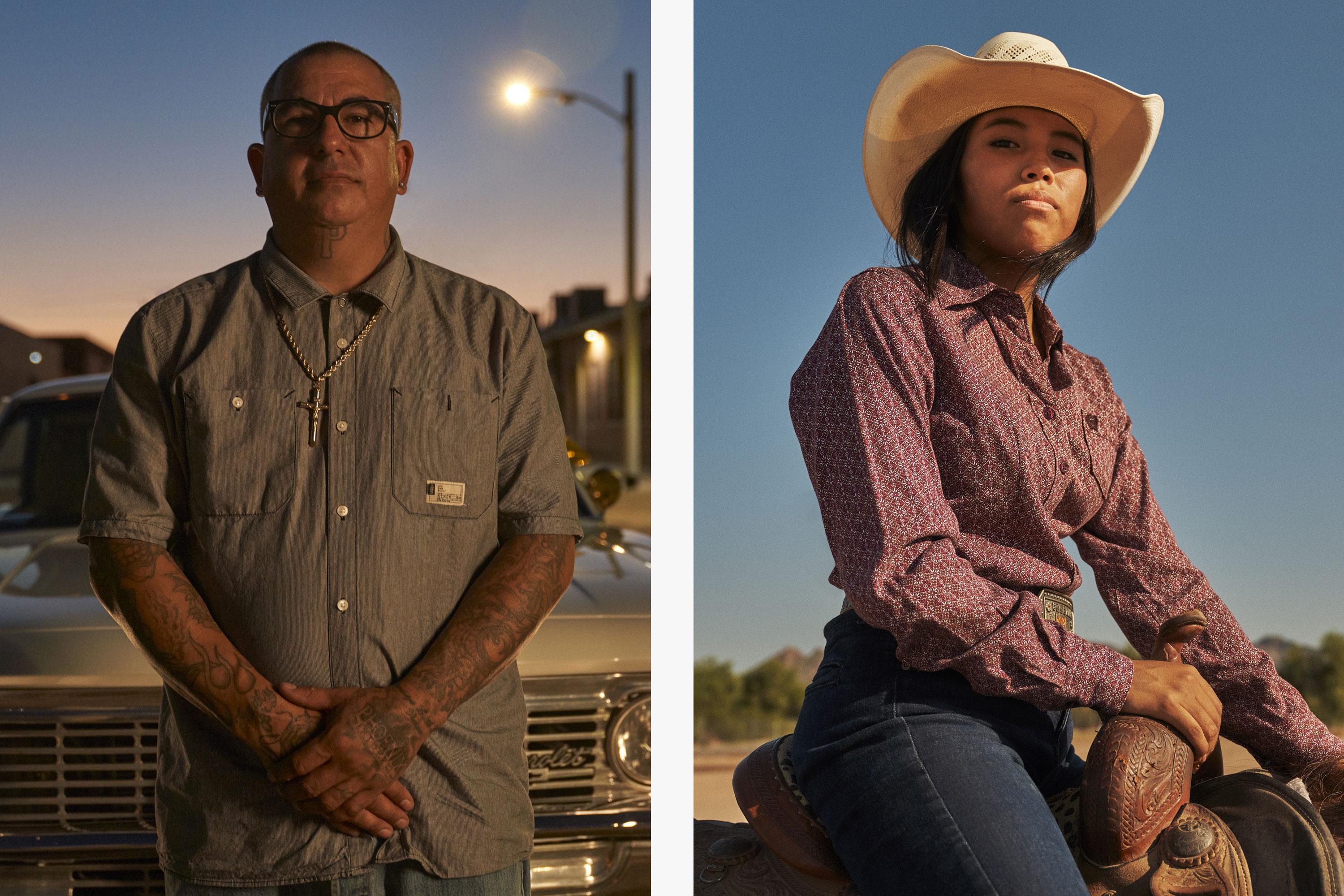
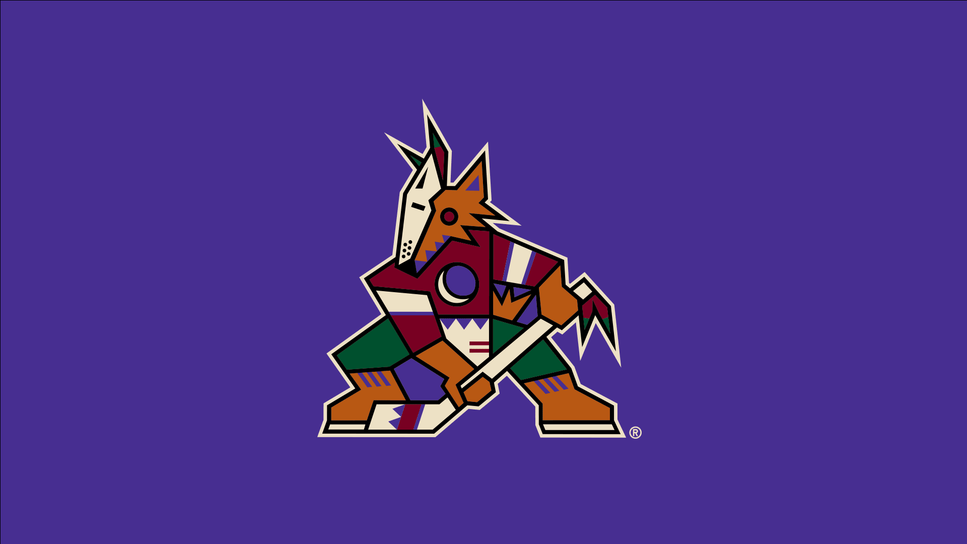
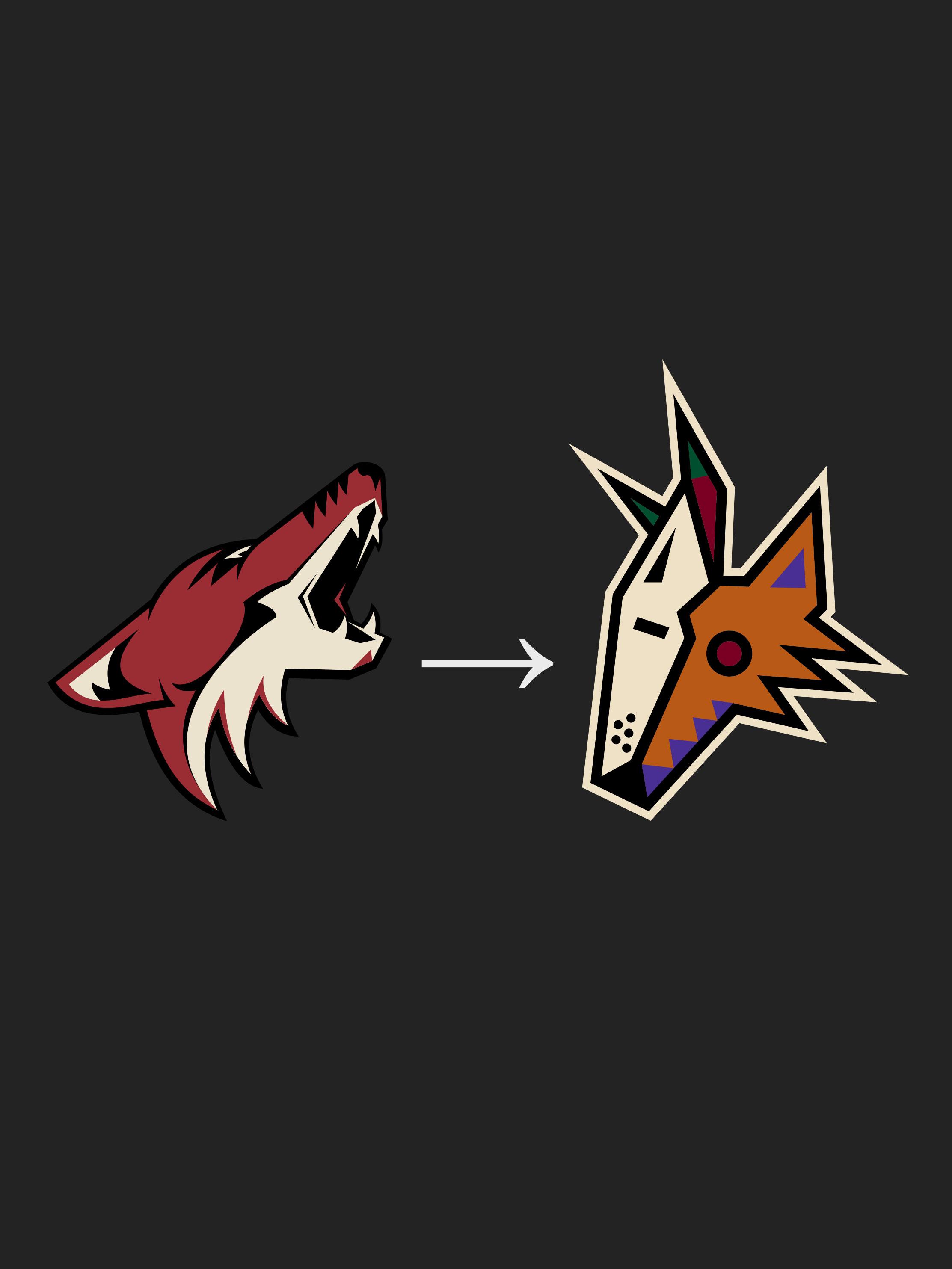
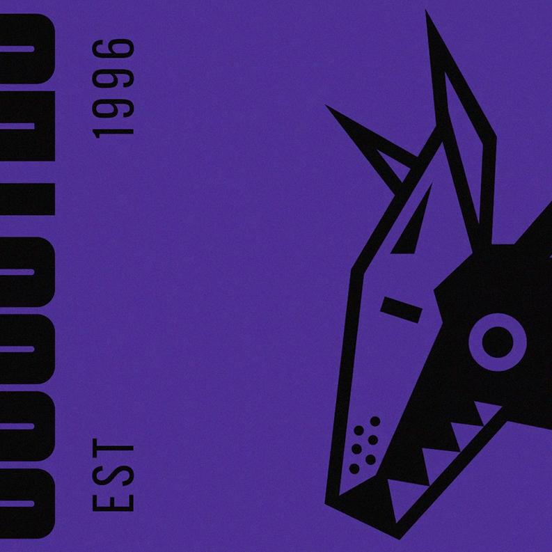
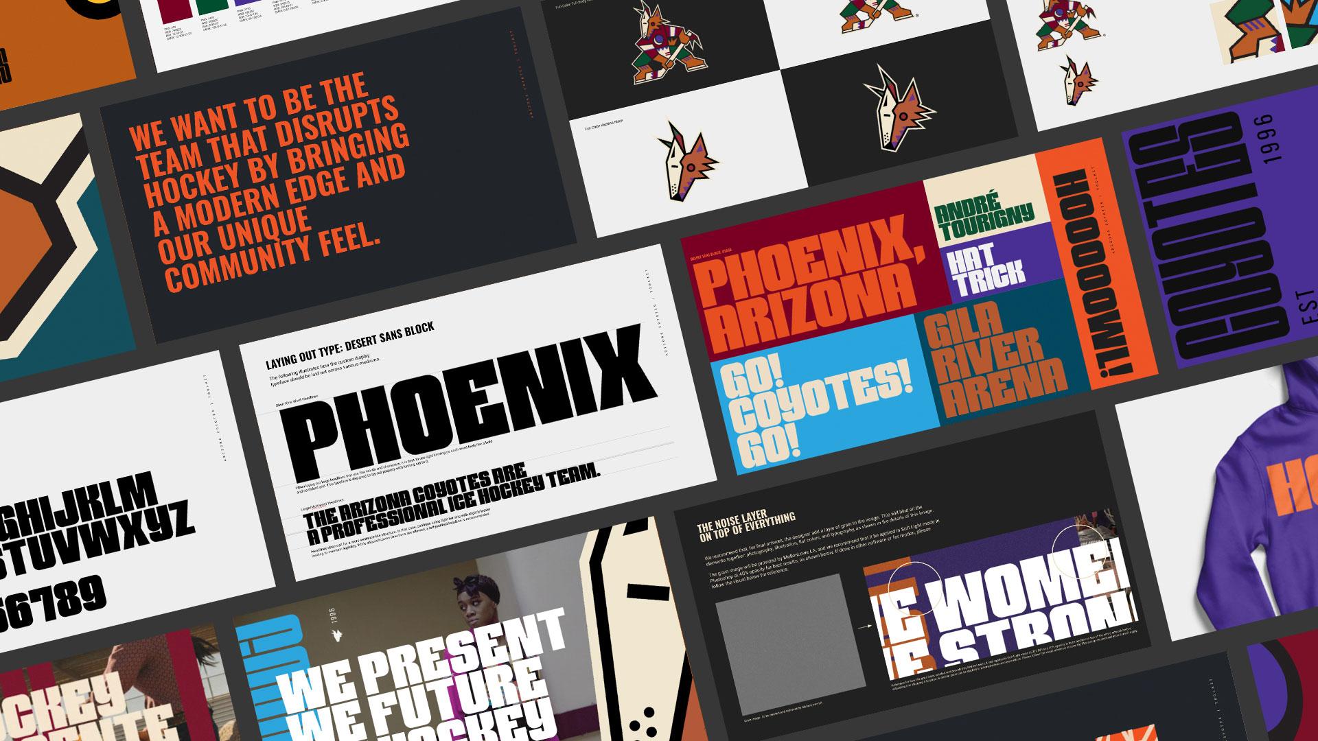
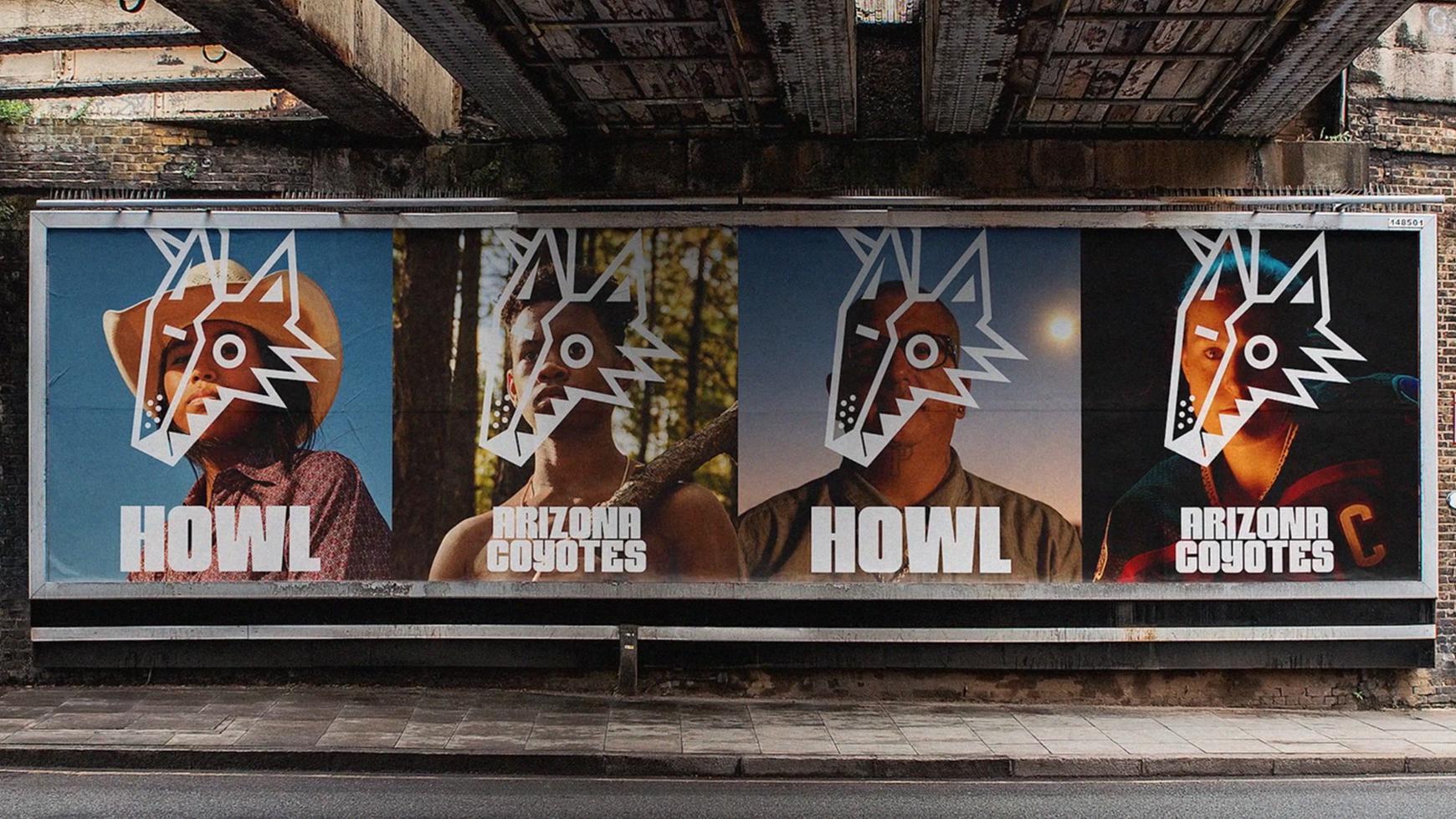
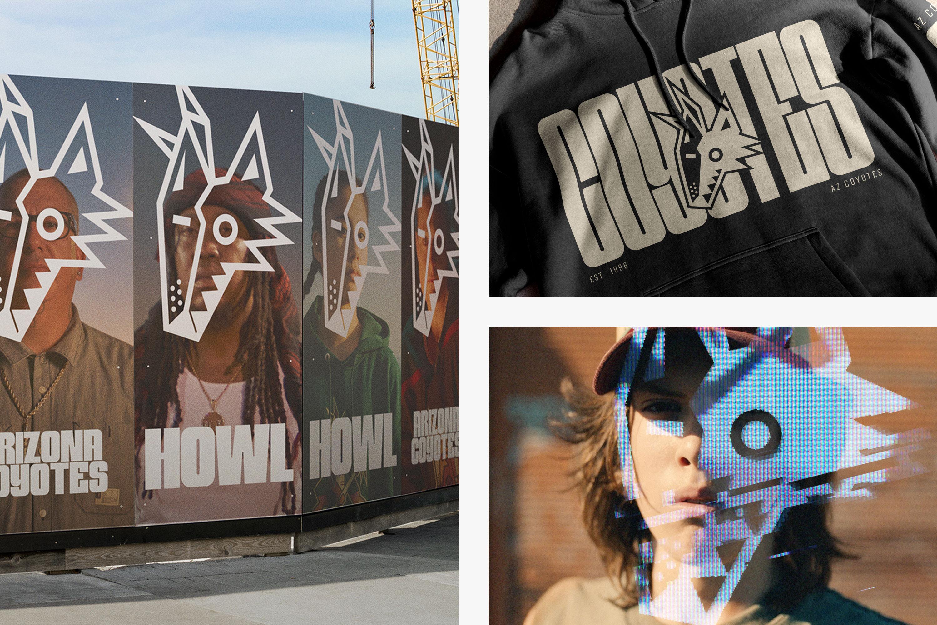
We rebranded the Arizona Coyotes as the "We Hockey" team. We started with their logo, which looked like every other logo in the league, and turned it into a celebration of the real Arizona: colorful and inspired by the diversity of its people.
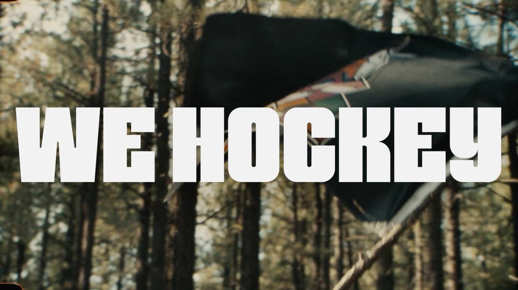
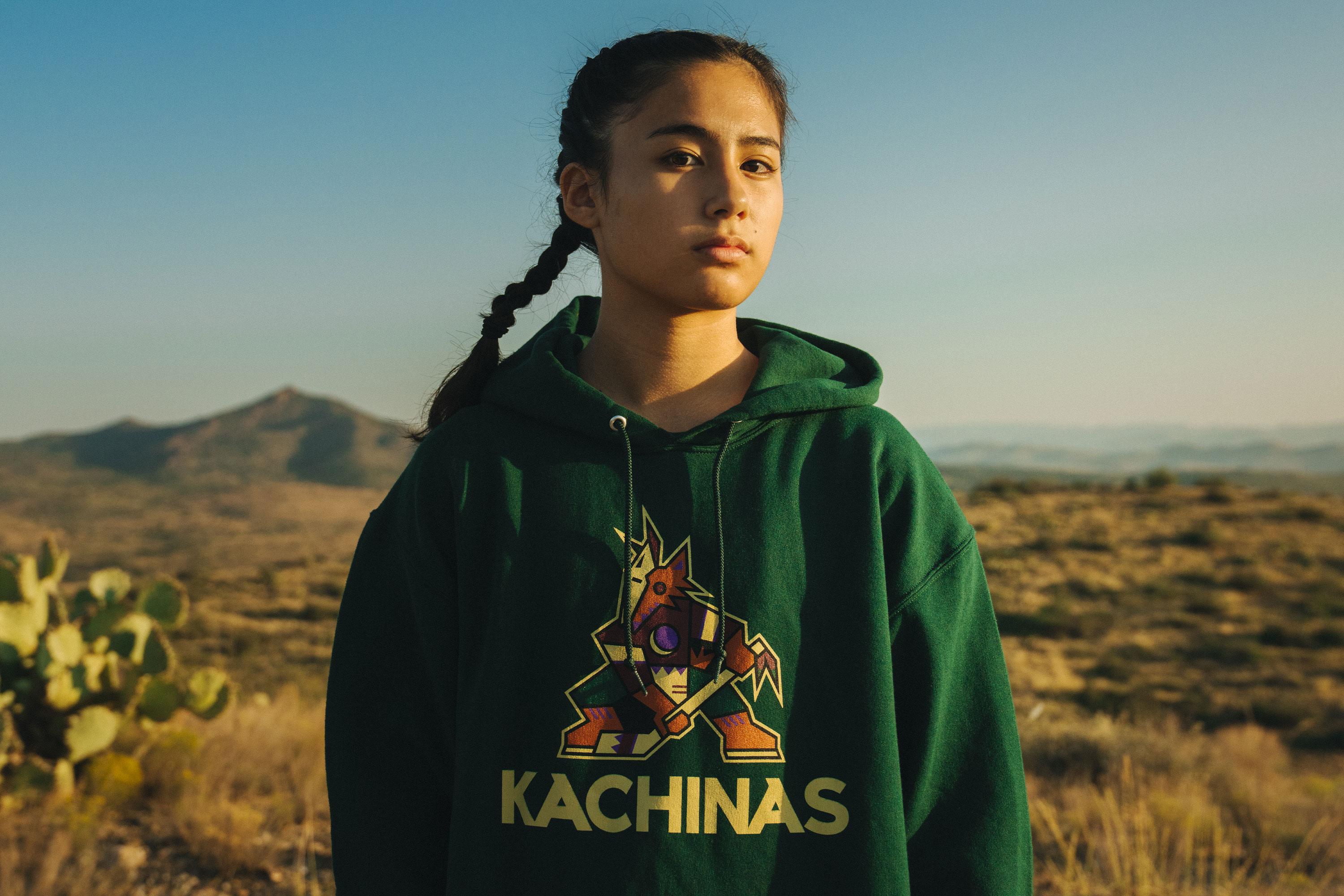
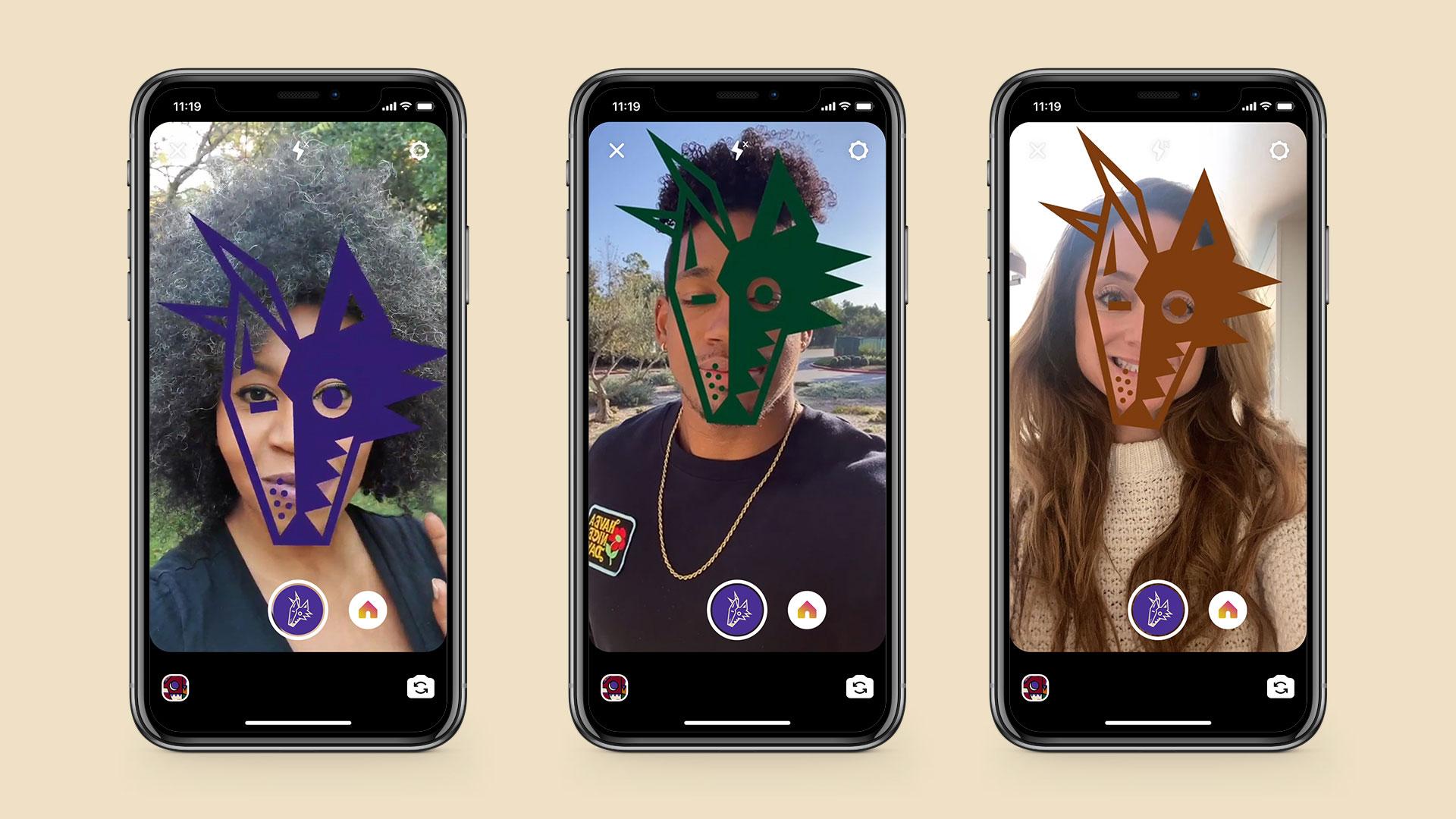
We invited everyone to play.
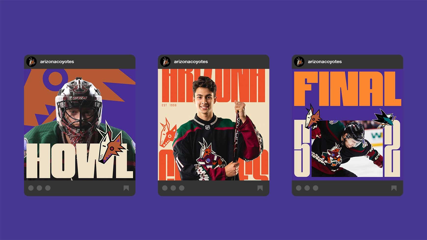
We invited everyone into our house and onto our ice, and gave the people of Arizona ownership of the team by putting them front and center and letting them claim the sport for themselves.

We defined a new voice.
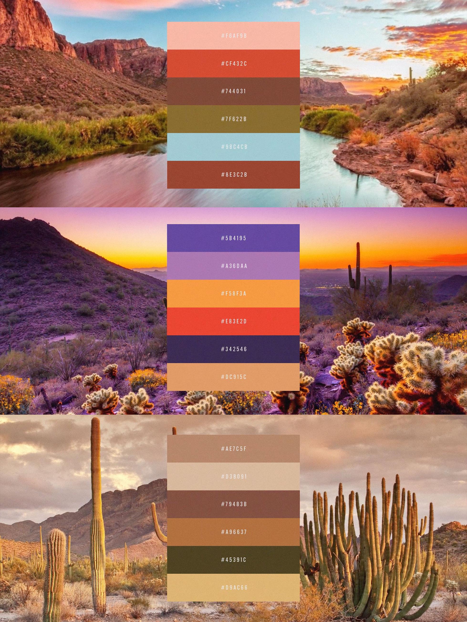
As we returned to the primary identity established in the early 1990s, this change allowed us to further reconnect to the cultural heritage of Arizona and its diverse and colorful landscape.

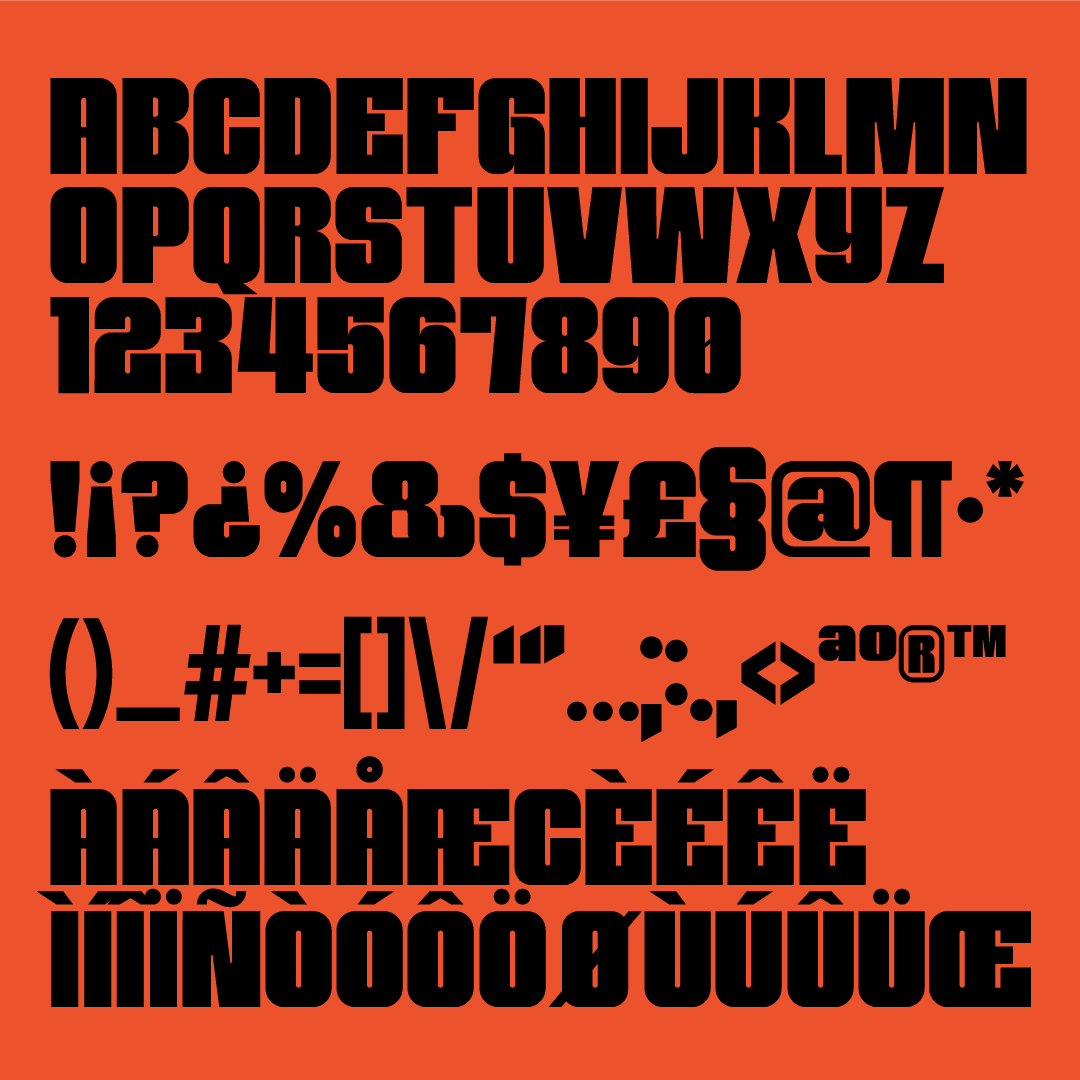
And developed a custom typeface family.
We created two custom-designed typefaces for our rebrand, which allowed us to use a direct and unique visual language to the campaign messaging. Inspired by heritage typographic design styles, these custom typefaces are a reinspired and contemporary nod to the team's original visual identity.

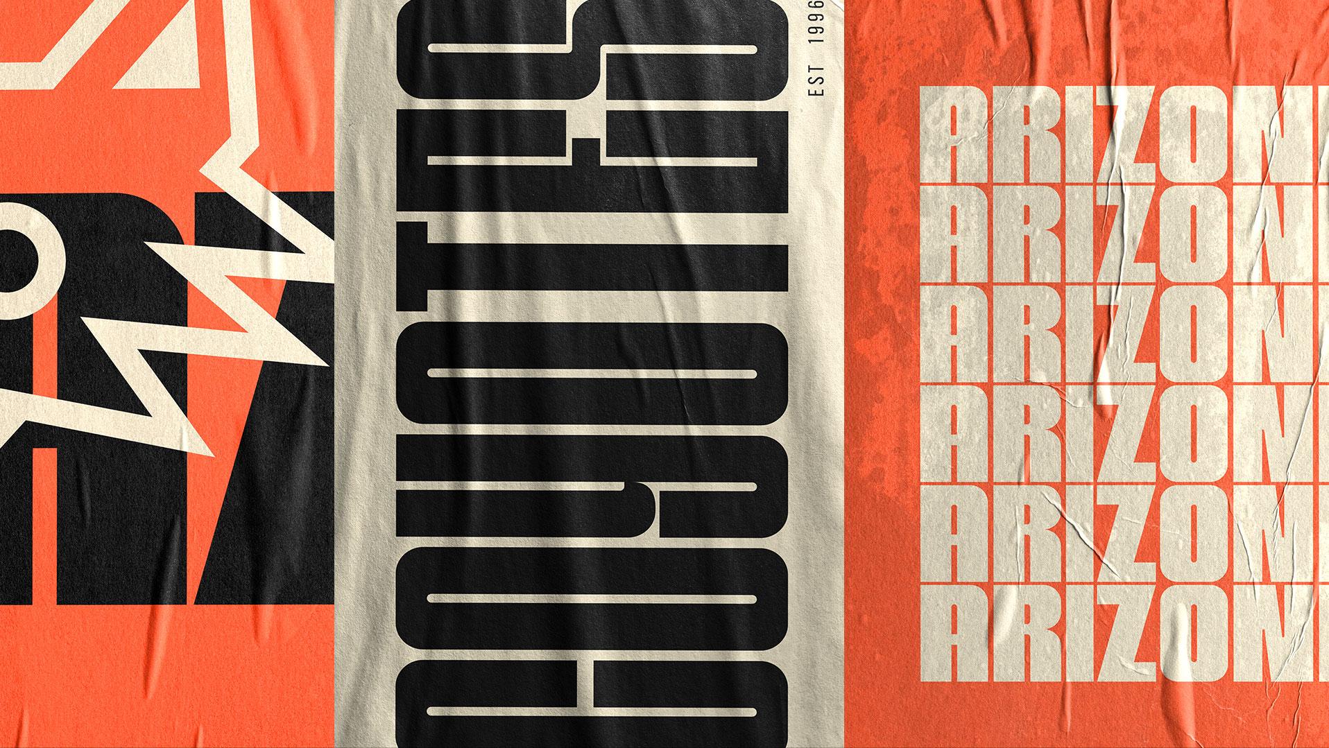
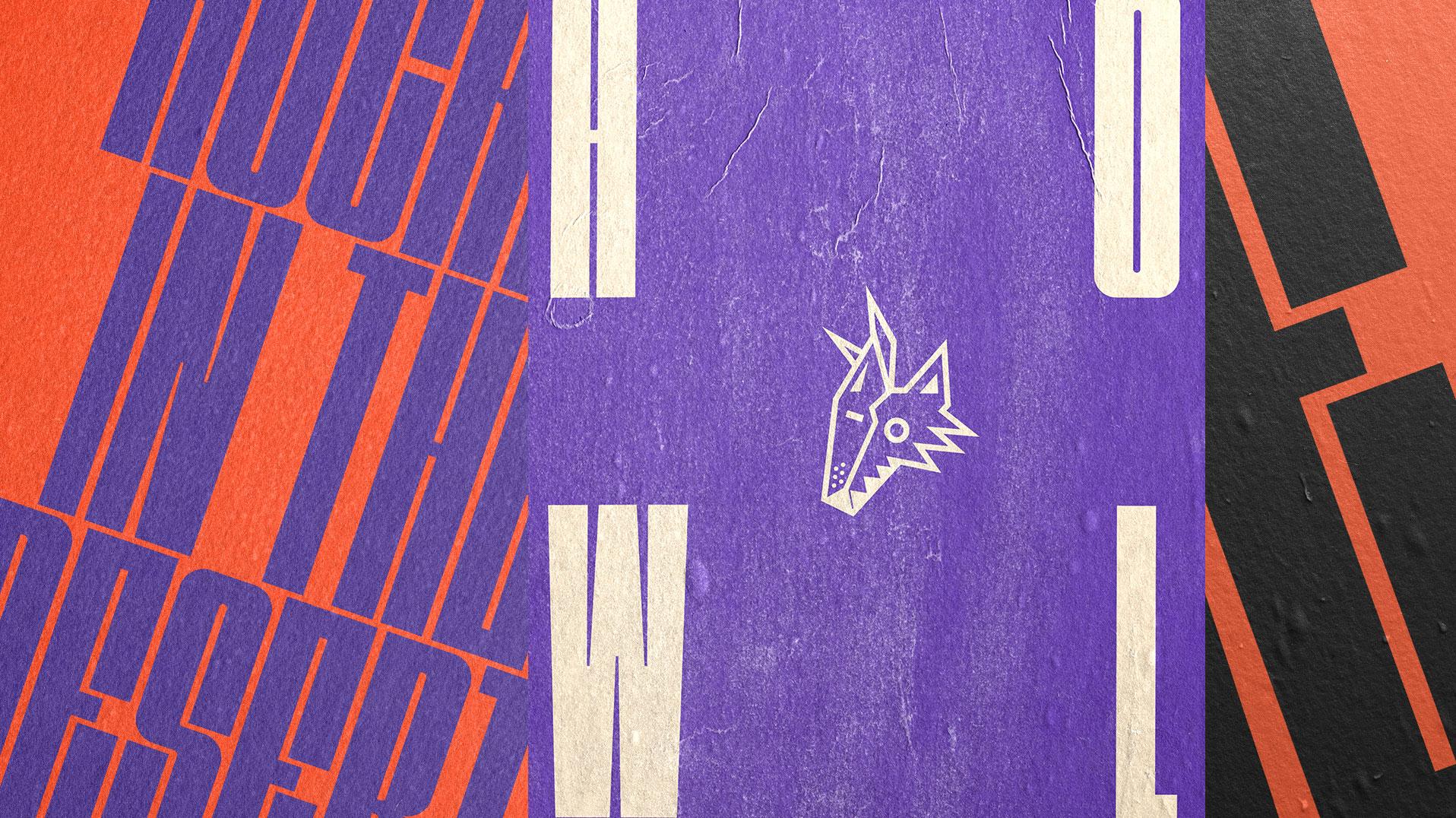
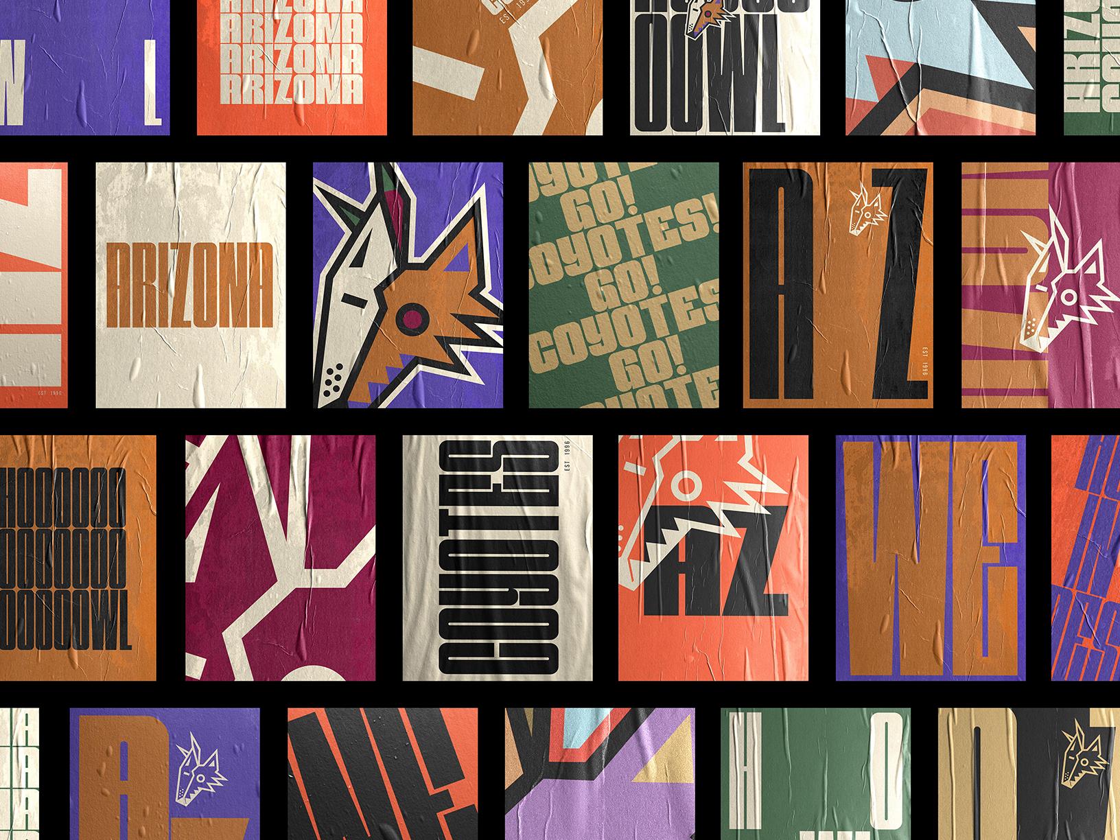
We turned a multichannel rebrand of a team into a more inclusive vision for the future of the sport and into a hockey that anyone can feel a part of.
Capabilities
- Creative
- Strategy
- MLPR
- Design Studio
- Yeti Productions
Offices
- Boston
- Los Angeles
Industry
- Sports
Recognition
2022 Cannes Lions — Silver
2022 Clio Awards — 2 Silver
2022 The One Show — Merit Award